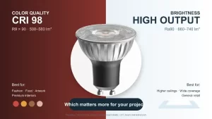
Comment choisir la bonne température de couleur pour un produit d'éclairage LED
Introduction
Choisir la température de couleur LED pour un projet commercial est rarement une simple question de sélectionner 3000K ou 4000K dans un catalogue. Dans les installations réelles, le mauvais choix peut créer un décalage entre l'image de marque et la perception réelle de l'espace, déformer la présentation des marchandises, réduire le confort des invités et déclencher des retouches coûteuses après la mise en service.
Pour les importateurs, les entrepreneurs et les acheteurs de projets, le risque n'est pas seulement esthétique. Il affecte l'approbation des maquettes, la cohérence des lots, les performances de gradation, le remplacement de maintenance et l'acceptation par le client après la livraison. Une décision de température de couleur prise trop tôt, ou basée uniquement sur une valeur Kelvin nominale, conduit souvent à des ajustements sur site, des réclamations de remplacement et des dommages réputationnels évitables.
Résumé Exécutif
La température de couleur LED définit la chaleur ou la fraîcheur visuelle de la lumière, pas la qualité du rendu des couleurs. Une sélection appropriée nécessite d'évaluer les besoins de l'application, l'IRC1/R92, gradation, réflexion de surface, lumière du jour et cohérence des lots ensemble, plutôt que de choisir uniquement par la valeur Kelvin.
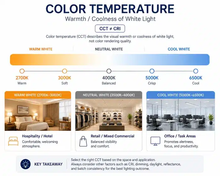
Sélection de la température de couleur LED pour l'éclairage commercial
Qu'est-ce que la température de couleur LED ?
Réalité sur site / commerciale
De nombreux problèmes de projet commencent au stade de la spécification, lorsque la température de couleur est traitée comme un raccourci pour la qualité globale de l'éclairage. Un consultant peut demander du 4000K pour un aspect “ plus propre ”, tandis qu'un opérateur peut préférer du 3000K pour une sensation “ premium ”. Si la discussion s'arrête là, le projet s'expose à des déceptions ultérieures car la perception de l'espace, l'apparence des marchandises et le confort des occupants dépendent de plus que l'étiquette Kelvin.
Cela importe lors de la maquette et de la mise en service car changer la CCT3 après l'achat des luminaires signifie généralement une réapprobation, un retard de livraison et une main-d'œuvre supplémentaire. Sur les grands sites tels que les hôtels, les chaînes de magasins et les étages de bureaux, le coût du remplacement des appareils installés est bien plus élevé que la validation précoce de l'apparence lumineuse.
Plongée approfondie & Solution d'ingénierie
La température de couleur LED décrit la couleur apparente de la lumière blanche, exprimée en Kelvin. En termes pratiques, elle indique si la lumière paraît plus chaude ou plus froide dans l'espace. Elle ne dit pas avec quelle précision les couleurs seront restituées.
Cette distinction est cruciale. Un luminaire 4000K n'est pas automatiquement “ plus clair ”, et un luminaire 3000K n'est pas automatiquement “ plus premium ”. Ce sont des hypothèses courantes du marché, mais elles sont incomplètes et parfois trompeuses. Un produit 3000K avec un bon équilibre spectral et une bonne restitution des rouges peut rendre la peau, le bois et la nourriture naturels et raffinés. Un autre produit 3000K avec une conception spectrale médiocre peut sembler terne, jaunâtre ou boueux. De même, un produit 4000K peut paraître net dans un bureau, mais si le spectre est faible ou la conception optique agressive, le résultat peut encore sembler dur et visuellement fatigant.
D'un point de vue technique, la CCT est l'apparence visuelle de la lumière, tandis que les métriques de rendu des couleurs évaluent la fidélité des couleurs naturelles des objets sous cette lumière. Ces aspects doivent être examinés séparément, puis vérifiés ensemble dans l'environnement réel.
Note d'Usine
Du point de vue de la fabrication, de nombreuses plaintes décrites comme une “ mauvaise température de couleur ” sont en réalité causées par un mauvais contrôle de la chromaticité4, tri des LED incohérent5, ou un rendu rouge faible plutôt que par la cible Kelvin nominale elle-même. Sur le papier, deux produits peuvent être étiquetés 3000K, mais sur site, ils peuvent paraître sensiblement différents.
Blanc chaud, Blanc neutre et Blanc froid : Différences clés
Réalité sur site / commerciale
Dans les projets commerciaux, “ blanc chaud ”, “ blanc neutre ” et “ blanc froid ” ne sont pas seulement des catégories de catalogue. Ils affectent directement le comportement des clients, l'image de marque et l'acceptation lors de l'inspection finale. Un propriétaire d'hôtel peut rejeter un couloir si la lumière semble trop froide. Un détaillant peut demander un remplacement si les couleurs des vêtements changent sous un éclairage qui semblait acceptable dans un échantillon mais pas sur le sol du magasin.
Un autre problème courant est l'incohérence entre les fournisseurs. La même valeur nominale de 3000K peut paraître plus jaune, plus verte ou légèrement rosée selon la sélection du boîtier LED, la formulation des phosphores, l'optique et l'interaction avec l'alimentation. Cela devient un problème majeur lorsque les projets mélangent des lots ou utilisent plusieurs familles d'appareils de sources différentes.
Plongée approfondie & Solution d'ingénierie
Le blanc chaud couvre généralement les gammes de CCT inférieures et crée une impression plus douce et détendue. Il est largement utilisé là où l'hospitalité, le confort et l'intimité sont prioritaires. Le blanc neutre se situe au milieu et est souvent choisi là où une clarté visuelle équilibrée et le confort sont requis. Le blanc froid tend à mettre en valeur un aspect plus propre et énergique et peut convenir aux environnements orientés tâches, mais il peut aussi augmenter la froideur visuelle s'il est surutilisé.
La vraie différence n'est pas seulement le point Kelvin. C'est la façon dont cette lumière interagit avec les matériaux, les finitions et les personnes.
- Dans les hôtels, le blanc chaud est souvent utilisé pour les chambres d'hôtes, les salons et les espaces décoratifs car il s'accorde bien avec le bois, les tissus et les tons de peau.
- Dans le commerce de détail, le bon choix dépend de la catégorie de marchandises. La mode, les cosmétiques et la bijouterie nécessitent généralement un réglage plus spécifique que les allées de vente générales.
- Dans les bureaux, le blanc neutre donne souvent de meilleurs résultats comme équilibre entre vigilance et confort, surtout sur de longues heures de fonctionnement.
- Dans les restaurants, une lumière plus chaude peut améliorer l'attrait des aliments et le temps de séjour des clients, mais si elle est poussée trop au chaud avec un rendu faible, l'espace peut sembler sombre ou jaunâtre.
- Dans les showrooms, la bonne réponse dépend du matériau du produit, de la finition et du positionnement de la marque. L'automobile, les meubles haut de gamme, l'électronique et les produits de luxe nécessitent souvent des approches différentes.
Une comparaison pratique est ci-dessous :
| Fonctionnalité | Blanc Chaud | Blanc Neutre | Impact Projet / Commercial |
|---|---|---|---|
| Impression visuelle | Détendu, doux, orienté hospitalité | Équilibré, propre, largement commercial | Une meilleure adéquation avec l'application réduit les demandes de modification |
| Tendance d'utilisation typique | Hôtels, restaurants, salons, chambres d'hôtes | Bureaux, zones de circulation, commerce polyvalent | Moins de corrections après installation |
| Réaction des matériaux | Améliore le bois, les finitions chaudes, les tons de peau | Plus neutre sur les matériaux mixtes | Une meilleure présentation du produit réduit le risque de rééclairage |
| Risque en cas de mauvaise application | Peut sembler terne dans les espaces à forte concentration de tâches | Can feel plain if brand demands strong mood | Incorrect selection leads to lower client acceptance |
If cool white is added for comparison, its strongest value is in environments that prioritize apparent brightness and functional clarity. But in many commercial interiors, using it without control of glare, reflectance, and rendering quality creates an overexposed and uncomfortable result.
Note d'Usine
During hotel commissioning, we often see one recurring issue: the approved sample downlight and the mass production batch carry the same 3000K label, but the installed effect is visibly different. This is usually a binning and consistency control problem, not a design intent problem. For commercial supply, nominal CCT is never enough; chromaticity tolerance and batch verification must also be controlled.
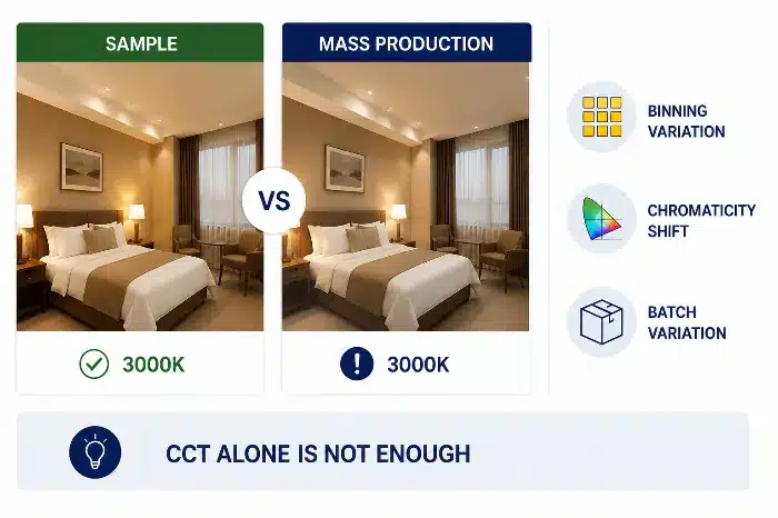
Warm Neutral Cool White LED Color Temperature for Commercial Lighting
How Color Temperature Affects Space Atmosphere, Product Display, and Visual Comfort
Réalité sur site / commerciale
This is where many projects succeed or fail. Color temperature affects more than mood. It changes how customers read the space, how long they stay, how products look, and how comfortable the environment feels over time. If the selected light makes skin look unhealthy, food look flat, or polished materials look lifeless, the commercial impact is immediate.
For contractors and operators, this becomes expensive when the issue is discovered only after shelves are stocked, furniture is installed, or guestrooms are dressed. At that stage, replacing lamps or drivers is not a simple technical correction. It disrupts opening schedules and creates avoidable friction between supplier, contractor, and owner.
Plongée approfondie & Solution d'ingénierie
Color temperature influences several layers of commercial perception:
Space atmosphere
Warmer light usually creates a more intimate and welcoming atmosphere. Cooler light tends to feel sharper and more active. Neither is universally better. The correct choice depends on the desired emotional response and brand positioning.
Product display
Different product categories respond differently to CCT:
- Clothing stores often need a balance that preserves fabric color, skin tone, and texture.
- Cosmetics areas require lighting that supports facial tones and red-based color accuracy.
- Jewelry often benefits from carefully layered lighting, where sparkle, contrast, and material tone must all be controlled.
- Hotels need different responses in lobbies, guestrooms, bathrooms, and banquet spaces.
Material texture
Wood, stone, metal, leather, and painted surfaces all react differently under warm and cool light. Warm light can enrich timber and fabric. Cooler light may reveal fine surface detail, but it can also flatten certain finishes if the spectrum is weak.
Dwell time and comfort
Lighting that is too cold or too sharp may reduce comfort, especially in leisure-oriented environments. Lighting that is too warm and low-contrast may reduce clarity in active commercial spaces. The right CCT helps support the intended duration of stay and user behavior.
Confort visuel
Higher-CCT lighting is often perceived as brighter, but that does not always mean better comfort. If glare control, beam angle, and luminance balance are poor, a cooler product can feel more fatiguing than a warmer one at the same illuminance.
This is why a fashion store, cosmetics counter, jewelry boutique, and hotel guestroom should not be specified using the same CCT logic. Their priorities are fundamentally different: skin tone, sparkle, texture, intimacy, task support, and brand mood all shift the correct answer.
Note d'Usine
In large hospitality projects, guestroom acceptance is often driven by how skin, bedding, timber veneer, and bathroom finishes look together under the final lighting scene. A technically acceptable CCT on paper can still fail commercially if the room feels visually cold at night or if the mirror lighting makes people look tired.
How to Choose LED Color Temperature for Different Commercial Applications
Réalité sur site / commerciale
Buyers often ask for a fixed CCT recommendation by application type, expecting a simple universal table. In practice, that approach creates problems because project conditions vary too much. The same 3000K can feel elegant in one hotel and too dim in another, depending on ceiling height, wall reflectance, daylight contribution, beam spread, and control strategy.
If these factors are ignored, the site team may end up trying to solve a design mismatch by changing lamp output, dimming level, or fixture quantity, which increases cost and complexity.
Plongée approfondie & Solution d'ingénierie
Typical ranges are useful as a starting point, but project conditions should always take priority.
A simplified commercial decision map can be used during early specification:
| Project Area | Common Starting CCT | Main Selection Risk | What to Verify Before Approval |
|---|---|---|---|
| Hotel guestroom / lounge | 2700K-3000K | Too warm for reading, mirror lighting, or detailed tasks | Zone function, dimming scene, skin tone, fabric and wood finish |
| Retail fashion / fitting room | 3000K-4000K | Garment color shift or poor skin tone | CRI, R9, mirror position, wall reflectance, brand mood |
| Cosmetics / premium display | 3000K-4000K | Weak red rendering or uneven facial appearance | R9, spectral balance, vertical illuminance, sample mock-up |
| Office / education | 3500K-4000K | Cold appearance, glare, or fatigue if pushed too cool | Visual comfort, glare control, daylight, work-surface reflectance |
| Restaurant / hospitality dining | 2700K-3000K | Food looks dull if rendering is weak | Food color, table surface, dimming behavior, evening ambience |
| Showroom / gallery | Project-specific | Material finish appears different from design intent | Real product samples, viewing distance, CRI/R9, batch consistency |
- Hospitality guestrooms often favor warmer tones, but bathroom mirror zones and reading areas may need a different balance for clarity.
- Retail fashion often works within warm-to-neutral ranges depending on brand style, fabric palette, and fitting-room priorities.
- Offices commonly use neutral white, but strong daylight, low-reflectance interiors, or anti-glare requirements can shift the best choice.
- Food and beverage spaces usually benefit from warmer tones, though fast-service formats may prefer slightly more neutral light for higher perceived energy.
- Showrooms and galleries depend heavily on the product category and finish properties.
The correct selection should be based on the following project variables:
- Hauteur sous plafond
- Surface reflectance of walls, floors, and furniture
- Natural daylight variation
- Dimming system and scene settings
- Brand identity
- Target customer group
- Fixture beam angle and spacing
- Maintenance replacement strategy
Instead of forcing a rigid matrix, the better process is:
- Confirm the commercial use of each zone.
- Define the target atmosphere and visual task.
- Review materials, daylight, and reflectance.
- Check rendering requirements, especially for red-sensitive objects and skin tone.
- Validate through mock-up before mass approval.
Note d'Usine
From a manufacturing perspective, the best commercial projects do not start with “What is your most popular color temperature?” They start with a zone-by-zone schedule. Once the application, target mood, and control method are defined, the lighting specification becomes much more stable and procurement risk drops sharply.
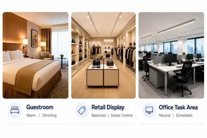
Zone-Based LED Color Temperature Planning for Commercial Lighting
CRI, R9, and Color Temperature: Why They Must Be Evaluated Together
Réalité sur site / commerciale
This is one of the most common sources of dissatisfaction in commercial lighting. A project may approve 3000K because it feels comfortable in the mock-up, but once installed, faces look tired, red products lose vibrancy, wood finishes appear flat, and food presentation becomes unappealing. The immediate assumption is often that the CCT is wrong, when the deeper issue is poor rendering quality.
For project teams, discovering this after installation is expensive because changing to a better-spectrum product may require new samples, re-testing, and batch replacement.
Plongée approfondie & Solution d'ingénierie
Color temperature determines whether light appears warm or cool. CRI and R9 determine how faithfully colors are rendered under that light.
This distinction is essential:
- CCT = visual warmth or coolness
- CRI = general color rendering quality
- R9 = strong red rendering performance, critical for skin, red merchandise, wood tones, meat, food, and warm materials
A 3000K luminaire may feel pleasant, but if R9 is weak, skin tones can look grayish, lipstick shades can look inaccurate, red fabrics can lose depth, and timber finishes can appear less rich. In retail and hospitality, this directly affects customer perception and purchasing behavior.
A practical comparison:
| Fonctionnalité | Lower Rendering Quality | Higher Rendering Quality | Impact Projet / Commercial |
|---|---|---|---|
| Skin tone appearance | Dull, tired, less natural | Healthy, natural, balanced | Better customer acceptance, fewer complaints |
| Red product presentation | Muted or brownish | Saturated and realistic | Stronger merchandise presentation |
| Wood and food appearance | Flat or lifeless | Richer and more convincing | Better guest and shopper experience |
| Commercial risk | Mock-up passes but final effect disappoints | More stable visual quality across applications | Lower replacement and correction cost |
For commercial specification, CCT should never be approved in isolation. The spectral behavior behind that white light must be checked, especially in categories involving cosmetics, apparel, food, timber, hospitality interiors, and human interaction zones.
Note d'Usine
During hotel commissioning and retail mock-ups, products with the same 3000K rating often produce very different reactions from the client. In many cases, the deciding factor is not the Kelvin point but the red rendering performance and overall spectral balance. This is why sample approval should include real materials, real finishes, and human skin evaluation, not only a white-wall observation.

Low CRI vs High CRI 3000K LED Lighting Comparison
Fixed CCT vs Tunable White LED Lighting: Selection Factors for Commercial Projects
Réalité sur site / commerciale
Tunable white6 is often presented as a premium upgrade because it offers flexibility. In real B2B projects, however, flexibility only adds value if the control system, driver compatibility, commissioning process, and maintenance strategy are properly managed. Otherwise, it creates more failure points, higher replacement complexity, and user confusion.
For contractors and operators, this matters because a tunable white system is not just a different LED board. It affects drivers, controls, dimming curves, replacement parts, training, and future servicing.
Plongée approfondie & Solution d'ingénierie
Fixed CCT products are simpler to specify, install, and maintain. They usually offer lower initial cost, easier batch control, and fewer compatibility issues across large-volume projects.
Tunable white products allow dynamic adjustment of CCT, which can be useful in premium hospitality, wellness, meeting spaces, multipurpose areas, or environments that respond to time of day. But the practical selection factors are broader than flexibility alone:
| Fonctionnalité | Fixed CCT | Tunable White | Impact Projet / Commercial |
|---|---|---|---|
| Initial product cost | Inférieur | Plus élevé | Fixed CCT suits cost-sensitive volume projects |
| Driver and control complexity | Inférieur | Plus élevé | More complex systems require better commissioning |
| Dimming behavior | Simpler to stabilize | Must be validated across full CCT range | Poor integration increases service calls |
| Replacement maintenance | Easier | More demanding | Wrong spare parts create mismatch risk |
| User operation | Minimal confusion | Risk of misuse or unintended scenes | Training and system lockout may be required |
| Batch consistency | Easier to manage | More variables to control | Validation effort is higher |
Key commercial questions before choosing tunable white:
- Is there a real operational need for CCT adjustment?
- Will the control platform and drivers be fully compatible?
- Has the dimming curve been tested across all scenes?
- Can the site maintenance team replace parts correctly later?
- Will users accidentally alter scenes that should remain fixed?
- Is consistency between zones and future replacement batches manageable?
In many projects, fixed CCT with properly designed dimming achieves better long-term reliability than a tunable system that is under-commissioned or poorly maintained.
Note d'Usine
From a manufacturing perspective, tunable white should be selected only when the project has a defined control logic and operational value. If the application does not genuinely need it, the added system complexity often creates more after-sales work than lighting benefit.
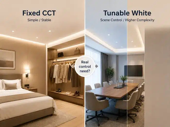
Fixed CCT vs Tunable White LED Lighting Selection
Common Mistakes When Choosing LED Color Temperature
Réalité sur site / commerciale
Most mistakes do not happen because teams ignore color temperature. They happen because teams evaluate it too narrowly. In commercial projects, that usually leads to approval-stage confidence and post-installation disappointment.
These mistakes are expensive because they appear late, after procurement or partial installation, when corrections affect labor, delivery, and client trust.
Plongée approfondie & Solution d'ingénierie
Some of the most common real-world mistakes include:
Choosing only by CCT, without checking spectrum and rendering
A product is selected as 3000K or 4000K based on catalog data, but no attention is given to CRI, R9, chromaticity stability, or the actual visual result on materials and people.
Approving a sample room, then ignoring batch consistency
The mock-up looks correct, but the delivered batch shows visible color shift. The issue is often poor consistency control between production lots, not the approved CCT target.
Using 6500K in offices just to create a “brighter” impression
This can increase visual coldness, exaggerate glare, and reduce long-duration comfort, especially when combined with high-luminance optics or reflective finishes.
Applying one CCT uniformly to all hotel guestroom zones
Using the same warm CCT everywhere may create comfort in the sleeping area but compromise bathroom clarity, mirror lighting quality, or reading performance.
Ignoring daylight interaction
A CCT that looks balanced at night may feel too warm or too dull in a daytime environment with strong natural light.
Mixing fixture families without chromaticity control
Downlights, strips, wall lights, and decorative luminaires may all be specified at the same Kelvin value, yet appear visibly different because their LEDs, optics, or diffusers are not matched.
Overlooking dimming behavior
Some LED products shift in appearance when dimmed, especially if the driver design is weak. A fixture approved at full output may look different in real scenes.
The engineering solution is to validate color temperature as part of a complete lighting system, not as an isolated product parameter.
Note d'Usine
During hotel commissioning, one frequent problem is uniform 2700K across the entire guestroom suite. It often works well for ambient mood, but once the guest uses the vanity area or reading light, the experience becomes less practical. Zone-based lighting logic usually performs better than one-number standardization.
Final Recommendation for Commercial Lighting Projects
Réalité sur site / commerciale
A reliable color temperature decision should survive procurement, installation, dimming, and long-term maintenance. If the choice only looks good in a small sample but fails under actual operating conditions, it is not a commercially sound specification.
For importers, distributors, and project contractors, the final recommendation must reduce replacement risk and improve consistency across batches and site phases.
Plongée approfondie & Solution d'ingénierie
A practical project decision framework is:
- Confirm the actual application of each zone.
- Define the target atmosphere and brand intent.
- Evaluate CCT together with CRI and R9.
- Review beam angle, glare control, and dimming behavior.
- Check wall and ceiling reflectance, key materials, and daylight conditions.
- Build a sample mock-up using real finishes and real viewing distances.
- Verify batch consistency before mass production approval.
- Confirm maintenance replacement strategy for future supply.
This process is more reliable than selecting by Kelvin number alone. It aligns lighting performance with how the space will actually be used and judged after handover.
Note d'Usine
From a manufacturing perspective, the most stable project outcomes come from sample validation plus batch control, not from catalog assumptions. Commercial lighting decisions should be locked only after confirming visual effect, rendering quality, dimming compatibility, and production consistency together.
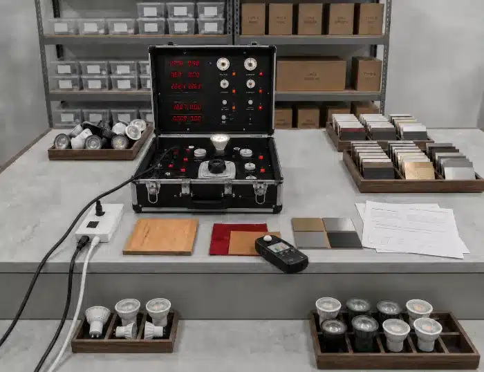
LED Lighting Sample Validation and Batch Control
Conclusion: Business Value
The right LED color temperature improves more than visual impression. It supports consistent product presentation, better occupant comfort, lower rejection risk, and more reliable project delivery. When selected together with CRI, R9, optics, dimming, and batch control, it reduces maintenance effort and lowers lifetime system cost.
Recommandation d'ingénierie B2B
For commercial projects, request sample review before bulk approval and confirm CCT, CRI, R9, chromaticity tolerance, dimming behavior, and batch consistency under real materials and viewing conditions. TECO can support project buyers with color temperature selection, GU10 LED product et MR16 LED product matching, lighting fixture selection, sample verification, and production consistency review before mass order approval.
Notes de bas de page
CRI, or Color Rendering Index, is a metric for comparing the color appearance of objects under a test light source with a reference source. The classic CRI method is defined in CIE 13.3-1995. See CIE 13.3-1995: Method of Measuring and Specifying Colour Rendering Properties of Light Sources. ↩
R9 is a special color rendering value for saturated red. It is important for skin tones, wood finishes, food, cosmetics, red merchandise, and hospitality interiors because a high general CRI value may still hide weak red rendering. ↩
CCT, or Correlated Color Temperature, describes the apparent warm or cool appearance of white light in Kelvin. DOE’s LED Color Characteristics fact sheet explains CCT, CRI, chromaticity, and other color-quality issues for white LED systems. See DOE LED Color Characteristics. ↩
Chromaticity control is the process of keeping emitted light color within a defined tolerance so luminaires look visually consistent. ANSI/NEMA C78.377 defines chromaticity ranges for solid-state lighting products. See ANSI C78.377 scope summary. ↩
LED binning is the manufacturing classification process used to group LEDs by characteristics such as brightness, voltage, and color. In commercial projects, binning and chromaticity control help reduce visible color mismatch between batches and fixture families. ↩
Tunable white is an LED lighting system that allows adjustment of white-light color temperature, typically through compatible drivers and controls. For projects that require more advanced color-quality evaluation, IES TM-30 provides a more detailed color rendition method than CRI alone. See IES Position on TM-30-18 et DOE TM-30 guidance. ↩