How to Choose the Right LED Lighting Product Color Temperature
Introduzione
Choosing LED color temperature for a commercial project is rarely a simple matter of selecting 3000K or 4000K from a catalog. In real installations, the wrong choice can create mismatch between brand image and actual space perception, distort merchandise presentation, reduce guest comfort, and trigger costly rework after commissioning.
For importers, contractors, and project buyers, the risk is not only aesthetic. It affects mock-up approval, batch consistency, dimming performance, maintenance replacement, and customer acceptance after handover. A color temperature decision made too early, or based only on a nominal Kelvin value, often leads to site adjustments, replacement claims, and avoidable reputation damage.
Sintesi Esecutiva
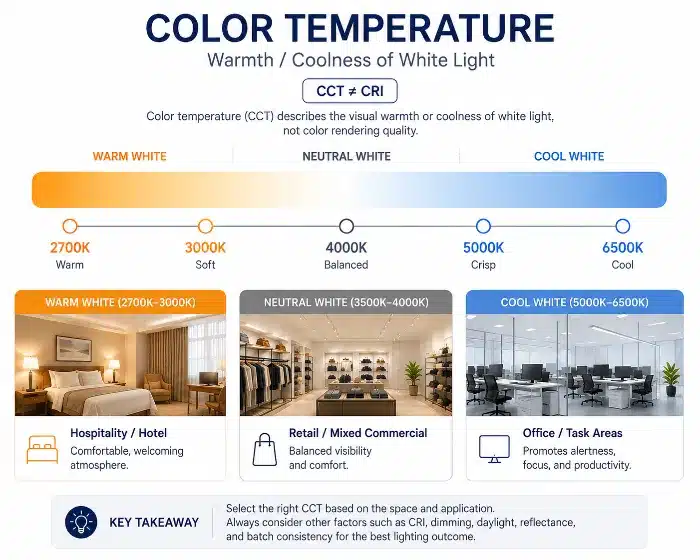
LED color temperature defines the visual warmth or coolness of light, not color rendering quality. Proper selection requires evaluating application needs, CRI1/R92, dimming, surface reflectance, daylight, and batch consistency together, rather than choosing by Kelvin value alone.
LED color temperature selection for commercial lighting
What Is LED Color Temperature?
Realtà in Cantiere / Commerciale
Many project issues start at the specification stage, when color temperature is treated as a shortcut for overall lighting quality. A consultant may request 4000K for a “cleaner” look, while an operator may prefer 3000K for a “premium” feel. If that discussion stops there, the project is exposed to later disappointment because space perception, merchandise appearance, and occupant comfort depend on more than the Kelvin label.
This matters during mock-up and commissioning because changing CCT3 after luminaire procurement usually means re-approval, delivery delay, and extra labor. In large sites such as hotels, retail chains, and office floors, the cost of replacing installed fittings is far higher than validating the light appearance early.
Approfondimento e Soluzione Ingegneristica
LED color temperature describes the apparent color of white light, expressed in Kelvin. In practical terms, it tells you whether the light looks warmer or cooler in the space. It does not tell you how accurately colors will be rendered.
This distinction is critical. A 4000K luminaire is not automatically “clearer,” and a 3000K luminaire is not automatically “more premium.” Those are common market assumptions, but they are incomplete and sometimes misleading. A 3000K product with strong spectral balance and good red rendering may make skin, wood, and food look natural and refined. Another 3000K product with poor spectral design may look dull, yellowish, or muddy. Likewise, a 4000K product may appear crisp in an office, but if the spectrum is weak or the optical design is aggressive, the result can still feel harsh and visually fatiguing.
From an engineering perspective, CCT is the light’s visual appearance, while color rendering metrics evaluate how well objects retain their natural color under that light. These must be reviewed separately, then checked together in the actual environment.
Nota di Fabbrica
From a manufacturing perspective, many complaints described as “wrong color temperature” are actually caused by poor chromaticity control4, inconsistent LED binning5, or weak red rendering rather than by the nominal Kelvin target itself. On paper, two products may both be labeled 3000K, but on-site they can look noticeably different.
Warm White, Neutral White, and Cool White: Key Differences
Realtà in Cantiere / Commerciale
In commercial projects, “warm white,” “neutral white,” and “cool white” are not just catalog categories. They directly affect customer behavior, brand impression, and acceptance during final inspection. A hotel owner may reject a corridor if the light feels too cold. A retailer may request replacement if garment colors shift under lighting that appeared acceptable in a sample box but not on the shop floor.
Another common issue is inconsistency between suppliers. The same nominal 3000K can appear more yellow, greener, or slightly pink depending on LED package selection, phosphor formulation, optics, and driver interaction. This becomes a major problem when projects mix batches or use multiple fixture families from different sources.
Approfondimento e Soluzione Ingegneristica
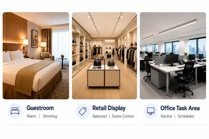
Warm white typically covers lower CCT ranges and creates a softer, more relaxed impression. It is widely used where hospitality, comfort, and intimacy are priorities. Neutral white sits in the middle and is often selected where balanced visual clarity and comfort are required. Cool white tends to emphasize a cleaner, more energetic look and may support task-oriented environments, but it can also increase visual coldness if overused.
The real difference is not only the Kelvin point. It is how that light interacts with materials, finishes, and people.
- In hotels, warm white often supports guestrooms, lounges, and decorative spaces because it works well with wood, fabric, and skin tones.
- In retail, the right choice depends on merchandise category. Fashion, cosmetics, and jewelry usually need more specific tuning than general retail aisles.
- In offices, neutral white often performs better as a balance between alertness and comfort, especially over long operating hours.
- In restaurants, warmer light can improve food appeal and customer dwell time, but if pushed too warm with weak rendering, the space may feel dim or yellowed.
- In showrooms, the right answer depends on the product material, finish, and brand positioning. Automotive, premium furniture, electronics, and luxury goods often require different approaches.
A practical comparison is below:
| Caratteristica | Warm White | Neutral White | Project / Commercial Impact |
|---|---|---|---|
| Visual impression | Relaxed, soft, hospitality-oriented | Balanced, clean, broadly commercial | Better alignment with application reduces change requests |
| Typical use tendency | Hotels, restaurants, lounges, guestrooms | Offices, circulation areas, mixed-use retail | Fewer post-installation corrections |
| Material response | Enhances wood, warm finishes, skin tones | More neutral on mixed materials | Better product presentation lowers re-lighting risk |
| Risk if misapplied | Can feel dull in task-heavy spaces | Can feel plain if brand demands strong mood | Incorrect selection leads to lower client acceptance |
If cool white is added for comparison, its strongest value is in environments that prioritize apparent brightness and functional clarity. But in many commercial interiors, using it without control of glare, reflectance, and rendering quality creates an overexposed and uncomfortable result.
Nota di Fabbrica
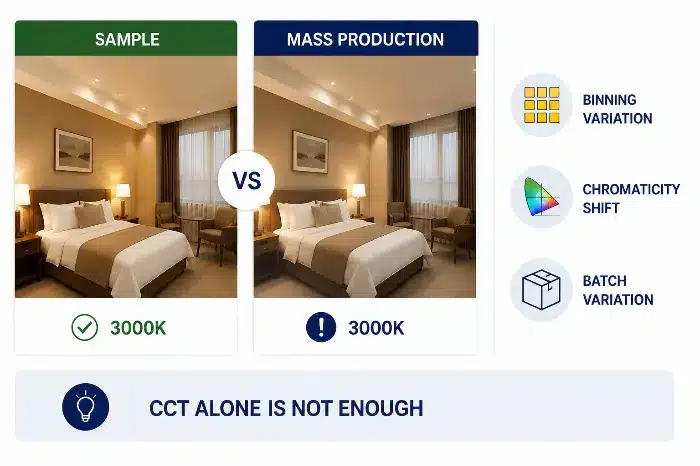
During hotel commissioning, we often see one recurring issue: the approved sample downlight and the mass production batch carry the same 3000K label, but the installed effect is visibly different. This is usually a binning and consistency control problem, not a design intent problem. For commercial supply, nominal CCT is never enough; chromaticity tolerance and batch verification must also be controlled.
Warm Neutral Cool White LED Color Temperature for Commercial Lighting
How Color Temperature Affects Space Atmosphere, Product Display, and Visual Comfort
Realtà in Cantiere / Commerciale
This is where many projects succeed or fail. Color temperature affects more than mood. It changes how customers read the space, how long they stay, how products look, and how comfortable the environment feels over time. If the selected light makes skin look unhealthy, food look flat, or polished materials look lifeless, the commercial impact is immediate.
For contractors and operators, this becomes expensive when the issue is discovered only after shelves are stocked, furniture is installed, or guestrooms are dressed. At that stage, replacing lamps or drivers is not a simple technical correction. It disrupts opening schedules and creates avoidable friction between supplier, contractor, and owner.
Approfondimento e Soluzione Ingegneristica
Color temperature influences several layers of commercial perception:
Space atmosphere
Warmer light usually creates a more intimate and welcoming atmosphere. Cooler light tends to feel sharper and more active. Neither is universally better. The correct choice depends on the desired emotional response and brand positioning.
Product display
Different product categories respond differently to CCT:
- Clothing stores often need a balance that preserves fabric color, skin tone, and texture.
- Cosmetics areas require lighting that supports facial tones and red-based color accuracy.
- Jewelry often benefits from carefully layered lighting, where sparkle, contrast, and material tone must all be controlled.
- Hotels need different responses in lobbies, guestrooms, bathrooms, and banquet spaces.
Material texture
Wood, stone, metal, leather, and painted surfaces all react differently under warm and cool light. Warm light can enrich timber and fabric. Cooler light may reveal fine surface detail, but it can also flatten certain finishes if the spectrum is weak.
Dwell time and comfort
Lighting that is too cold or too sharp may reduce comfort, especially in leisure-oriented environments. Lighting that is too warm and low-contrast may reduce clarity in active commercial spaces. The right CCT helps support the intended duration of stay and user behavior.
Visual comfort
Higher-CCT lighting is often perceived as brighter, but that does not always mean better comfort. If glare control, beam angle, and luminance balance are poor, a cooler product can feel more fatiguing than a warmer one at the same illuminance.
This is why a fashion store, cosmetics counter, jewelry boutique, and hotel guestroom should not be specified using the same CCT logic. Their priorities are fundamentally different: skin tone, sparkle, texture, intimacy, task support, and brand mood all shift the correct answer.
Nota di Fabbrica
In large hospitality projects, guestroom acceptance is often driven by how skin, bedding, timber veneer, and bathroom finishes look together under the final lighting scene. A technically acceptable CCT on paper can still fail commercially if the room feels visually cold at night or if the mirror lighting makes people look tired.
How to Choose LED Color Temperature for Different Commercial Applications
Realtà in Cantiere / Commerciale
Buyers often ask for a fixed CCT recommendation by application type, expecting a simple universal table. In practice, that approach creates problems because project conditions vary too much. The same 3000K can feel elegant in one hotel and too dim in another, depending on ceiling height, wall reflectance, daylight contribution, beam spread, and control strategy.
If these factors are ignored, the site team may end up trying to solve a design mismatch by changing lamp output, dimming level, or fixture quantity, which increases cost and complexity.
Approfondimento e Soluzione Ingegneristica
Typical ranges are useful as a starting point, but project conditions should always take priority.
A simplified commercial decision map can be used during early specification:
| Project Area | Common Starting CCT | Main Selection Risk | What to Verify Before Approval |
|---|---|---|---|
| Hotel guestroom / lounge | 2700K-3000K | Too warm for reading, mirror lighting, or detailed tasks | Zone function, dimming scene, skin tone, fabric and wood finish |
| Retail fashion / fitting room | 3000K-4000K | Garment color shift or poor skin tone | CRI, R9, mirror position, wall reflectance, brand mood |
| Cosmetics / premium display | 3000K-4000K | Weak red rendering or uneven facial appearance | R9, spectral balance, vertical illuminance, sample mock-up |
| Office / education | 3500K-4000K | Cold appearance, glare, or fatigue if pushed too cool | Visual comfort, glare control, daylight, work-surface reflectance |
| Restaurant / hospitality dining | 2700K-3000K | Food looks dull if rendering is weak | Food color, table surface, dimming behavior, evening ambience |
| Showroom / gallery | Project-specific | Material finish appears different from design intent | Real product samples, viewing distance, CRI/R9, batch consistency |
- Hospitality guestrooms often favor warmer tones, but bathroom mirror zones and reading areas may need a different balance for clarity.
- Retail fashion often works within warm-to-neutral ranges depending on brand style, fabric palette, and fitting-room priorities.
- Offices commonly use neutral white, but strong daylight, low-reflectance interiors, or anti-glare requirements can shift the best choice.
- Food and beverage spaces usually benefit from warmer tones, though fast-service formats may prefer slightly more neutral light for higher perceived energy.
- Showrooms and galleries depend heavily on the product category and finish properties.
The correct selection should be based on the following project variables:
- Altezza del soffitto
- Surface reflectance of walls, floors, and furniture
- Natural daylight variation
- Dimming system and scene settings
- Brand identity
- Target customer group
- Fixture beam angle and spacing
- Maintenance replacement strategy
Instead of forcing a rigid matrix, the better process is:
- Confirm the commercial use of each zone.
- Define the target atmosphere and visual task.
- Review materials, daylight, and reflectance.
- Check rendering requirements, especially for red-sensitive objects and skin tone.
- Validate through mock-up before mass approval.
Nota di Fabbrica
From a manufacturing perspective, the best commercial projects do not start with “What is your most popular color temperature?” They start with a zone-by-zone schedule. Once the application, target mood, and control method are defined, the lighting specification becomes much more stable and procurement risk drops sharply.
Zone-Based LED Color Temperature Planning for Commercial Lighting
CRI, R9, and Color Temperature: Why They Must Be Evaluated Together
Realtà in Cantiere / Commerciale
This is one of the most common sources of dissatisfaction in commercial lighting. A project may approve 3000K because it feels comfortable in the mock-up, but once installed, faces look tired, red products lose vibrancy, wood finishes appear flat, and food presentation becomes unappealing. The immediate assumption is often that the CCT is wrong, when the deeper issue is poor rendering quality.
For project teams, discovering this after installation is expensive because changing to a better-spectrum product may require new samples, re-testing, and batch replacement.
Approfondimento e Soluzione Ingegneristica
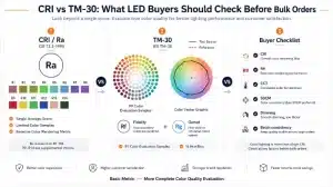
Color temperature determines whether light appears warm or cool. CRI and R9 determine how faithfully colors are rendered under that light.
This distinction is essential:
- CCT = visual warmth or coolness
- CRI = general color rendering quality
- R9 = strong red rendering performance, critical for skin, red merchandise, wood tones, meat, food, and warm materials
A 3000K luminaire may feel pleasant, but if R9 is weak, skin tones can look grayish, lipstick shades can look inaccurate, red fabrics can lose depth, and timber finishes can appear less rich. In retail and hospitality, this directly affects customer perception and purchasing behavior.
A practical comparison:
| Caratteristica | Lower Rendering Quality | Higher Rendering Quality | Project / Commercial Impact |
|---|---|---|---|
| Skin tone appearance | Dull, tired, less natural | Healthy, natural, balanced | Better customer acceptance, fewer complaints |
| Red product presentation | Muted or brownish | Saturated and realistic | Stronger merchandise presentation |
| Wood and food appearance | Flat or lifeless | Richer and more convincing | Better guest and shopper experience |
| Commercial risk | Mock-up passes but final effect disappoints | More stable visual quality across applications | Lower replacement and correction cost |
For commercial specification, CCT should never be approved in isolation. The spectral behavior behind that white light must be checked, especially in categories involving cosmetics, apparel, food, timber, hospitality interiors, and human interaction zones.
Nota di Fabbrica
During hotel commissioning and retail mock-ups, products with the same 3000K rating often produce very different reactions from the client. In many cases, the deciding factor is not the Kelvin point but the red rendering performance and overall spectral balance. This is why sample approval should include real materials, real finishes, and human skin evaluation, not only a white-wall observation.

Low CRI vs High CRI 3000K LED Lighting Comparison
Fixed CCT vs Tunable White LED Lighting: Selection Factors for Commercial Projects
Realtà in Cantiere / Commerciale
Tunable white6 is often presented as a premium upgrade because it offers flexibility. In real B2B projects, however, flexibility only adds value if the control system, driver compatibility, commissioning process, and maintenance strategy are properly managed. Otherwise, it creates more failure points, higher replacement complexity, and user confusion.
For contractors and operators, this matters because a tunable white system is not just a different LED board. It affects drivers, controls, dimming curves, replacement parts, training, and future servicing.
Approfondimento e Soluzione Ingegneristica
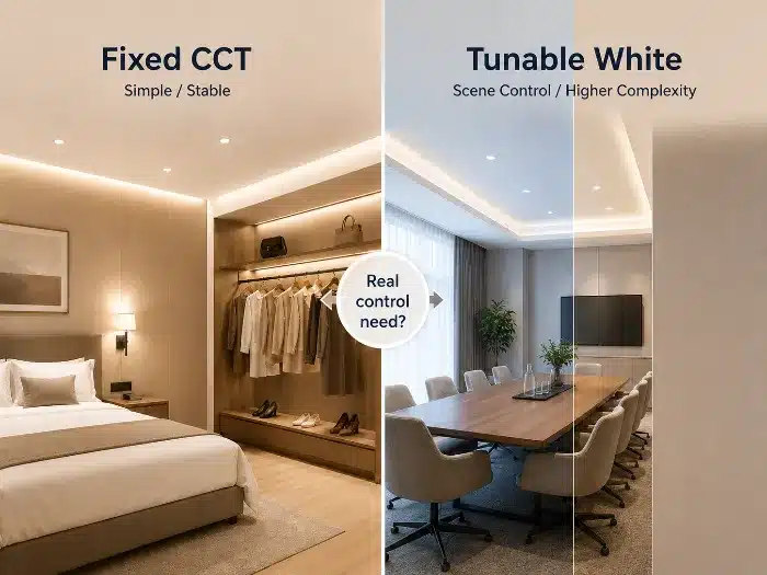
Fixed CCT products are simpler to specify, install, and maintain. They usually offer lower initial cost, easier batch control, and fewer compatibility issues across large-volume projects.
Tunable white products allow dynamic adjustment of CCT, which can be useful in premium hospitality, wellness, meeting spaces, multipurpose areas, or environments that respond to time of day. But the practical selection factors are broader than flexibility alone:
| Caratteristica | Fixed CCT | Bianco regolabile | Project / Commercial Impact |
|---|---|---|---|
| Initial product cost | Più basso | Più alto | Fixed CCT suits cost-sensitive volume projects |
| Driver and control complexity | Più basso | Più alto | More complex systems require better commissioning |
| Dimming behavior | Simpler to stabilize | Must be validated across full CCT range | Poor integration increases service calls |
| Replacement maintenance | Easier | More demanding | Wrong spare parts create mismatch risk |
| User operation | Minimal confusion | Risk of misuse or unintended scenes | Training and system lockout may be required |
| Batch consistency | Easier to manage | More variables to control | Validation effort is higher |
Key commercial questions before choosing tunable white:
- Is there a real operational need for CCT adjustment?
- Will the control platform and drivers be fully compatible?
- Has the dimming curve been tested across all scenes?
- Can the site maintenance team replace parts correctly later?
- Will users accidentally alter scenes that should remain fixed?
- Is consistency between zones and future replacement batches manageable?
In many projects, fixed CCT with properly designed dimming achieves better long-term reliability than a tunable system that is under-commissioned or poorly maintained.
Nota di Fabbrica
From a manufacturing perspective, tunable white should be selected only when the project has a defined control logic and operational value. If the application does not genuinely need it, the added system complexity often creates more after-sales work than lighting benefit.
Fixed CCT vs Tunable White LED Lighting Selection
Common Mistakes When Choosing LED Color Temperature
Realtà in Cantiere / Commerciale
Most mistakes do not happen because teams ignore color temperature. They happen because teams evaluate it too narrowly. In commercial projects, that usually leads to approval-stage confidence and post-installation disappointment.
These mistakes are expensive because they appear late, after procurement or partial installation, when corrections affect labor, delivery, and client trust.
Approfondimento e Soluzione Ingegneristica
Some of the most common real-world mistakes include:
Choosing only by CCT, without checking spectrum and rendering
A product is selected as 3000K or 4000K based on catalog data, but no attention is given to CRI, R9, chromaticity stability, or the actual visual result on materials and people.
Approving a sample room, then ignoring batch consistency
The mock-up looks correct, but the delivered batch shows visible color shift. The issue is often poor consistency control between production lots, not the approved CCT target.
Using 6500K in offices just to create a “brighter” impression
This can increase visual coldness, exaggerate glare, and reduce long-duration comfort, especially when combined with high-luminance optics or reflective finishes.
Applying one CCT uniformly to all hotel guestroom zones
Using the same warm CCT everywhere may create comfort in the sleeping area but compromise bathroom clarity, mirror lighting quality, or reading performance.
Ignoring daylight interaction
A CCT that looks balanced at night may feel too warm or too dull in a daytime environment with strong natural light.
Mixing fixture families without chromaticity control
Downlights, strips, wall lights, and decorative luminaires may all be specified at the same Kelvin value, yet appear visibly different because their LEDs, optics, or diffusers are not matched.
Overlooking dimming behavior
Some LED products shift in appearance when dimmed, especially if the driver design is weak. A fixture approved at full output may look different in real scenes.
The engineering solution is to validate color temperature as part of a complete lighting system, not as an isolated product parameter.
Nota di Fabbrica
During hotel commissioning, one frequent problem is uniform 2700K across the entire guestroom suite. It often works well for ambient mood, but once the guest uses the vanity area or reading light, the experience becomes less practical. Zone-based lighting logic usually performs better than one-number standardization.
Final Recommendation for Commercial Lighting Projects
Realtà in Cantiere / Commerciale
A reliable color temperature decision should survive procurement, installation, dimming, and long-term maintenance. If the choice only looks good in a small sample but fails under actual operating conditions, it is not a commercially sound specification.
For importers, distributors, and project contractors, the final recommendation must reduce replacement risk and improve consistency across batches and site phases.
Approfondimento e Soluzione Ingegneristica
A practical project decision framework is:
- Confirm the actual application of each zone.
- Define the target atmosphere and brand intent.
- Evaluate CCT together with CRI and R9.
- Review beam angle, glare control, and dimming behavior.
- Check wall and ceiling reflectance, key materials, and daylight conditions.
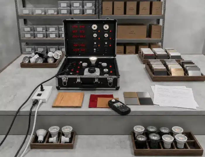
- Build a sample mock-up using real finishes and real viewing distances.
- Verify batch consistency before mass production approval.
- Confirm maintenance replacement strategy for future supply.
This process is more reliable than selecting by Kelvin number alone. It aligns lighting performance with how the space will actually be used and judged after handover.
Nota di Fabbrica
From a manufacturing perspective, the most stable project outcomes come from sample validation plus batch control, not from catalog assumptions. Commercial lighting decisions should be locked only after confirming visual effect, rendering quality, dimming compatibility, and production consistency together.
LED Lighting Sample Validation and Batch Control
Conclusion: Business Value
The right LED color temperature improves more than visual impression. It supports consistent product presentation, better occupant comfort, lower rejection risk, and more reliable project delivery. When selected together with CRI, R9, optics, dimming, and batch control, it reduces maintenance effort and lowers lifetime system cost.
Raccomandazione di Ingegneria B2B
For commercial projects, request sample review before bulk approval and confirm CCT, CRI, R9, chromaticity tolerance, dimming behavior, and batch consistency under real materials and viewing conditions. TECO can support project buyers with color temperature selection, GU10 LED product e MR16 LED product matching, lighting fixture selection, sample verification, and production consistency review before mass order approval.
Note a piè di pagina
-
CRI, or Color Rendering Index, is a metric for comparing the color appearance of objects under a test light source with a reference source. The classic CRI method is defined in CIE 13.3-1995. See CIE 13.3-1995: Method of Measuring and Specifying Colour Rendering Properties of Light Sources. ↩
-
R9 is a special color rendering value for saturated red. It is important for skin tones, wood finishes, food, cosmetics, red merchandise, and hospitality interiors because a high general CRI value may still hide weak red rendering. ↩
-
CCT, or Correlated Color Temperature, describes the apparent warm or cool appearance of white light in Kelvin. DOE’s LED Color Characteristics fact sheet explains CCT, CRI, chromaticity, and other color-quality issues for white LED systems. See DOE LED Color Characteristics. ↩
-
Chromaticity control is the process of keeping emitted light color within a defined tolerance so luminaires look visually consistent. ANSI/NEMA C78.377 defines chromaticity ranges for solid-state lighting products. See ANSI C78.377 scope summary. ↩
-
LED binning is the manufacturing classification process used to group LEDs by characteristics such as brightness, voltage, and color. In commercial projects, binning and chromaticity control help reduce visible color mismatch between batches and fixture families. ↩
-
Tunable white is an LED lighting system that allows adjustment of white-light color temperature, typically through compatible drivers and controls. For projects that require more advanced color-quality evaluation, IES TM-30 provides a more detailed color rendition method than CRI alone. See IES Position on TM-30-18 e DOE TM-30 guidance. ↩